Turning First-Time Players into Daily Users
Redesigned a mobile quiz gaming app to improve habit formation, daily engagement, and long-term retention.
Project Context
Quizy Games is a real money based informative gaming app where users can learn about latest topics trending News through Quizzes.
There where 3 different types of games. One 2 One, Contest & Quizy Go. All the games had a different user experience and there was no clear hook loop to drive repeat behavior.
- •Primary audience: Mobile-first players in India
- •Primary KPI: Improve user retention rate
Core Problem: No Reason to Return
The team already had posthog intergrated and had a good understanding of where users were dropping off.
Most users were trying the app once or twice, but hardly return after the first week. The core problem was a lack of a clear hook loop to drive repeat behavior.
- •Retention was critically low — most users dropped off within days
- •Very few users returned after their first session
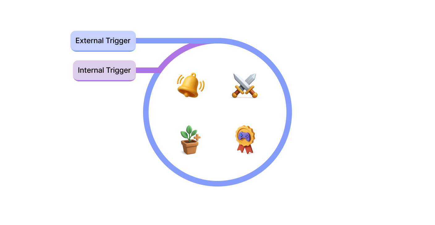
UX Strategy: Build a Simple Hook Loop
To improve repeat behavior, we used a clear framework: Trigger, Action, Variable Reward, and Investment.
Each step was translated into one focused product moment so users could understand it instantly.
- •Trigger: Daily challenge surfaced at the right time
- •Action: fast quiz interaction with low effort
- •Variable Reward: badges and celebration moments
- •Investment: social invite to bring friends in
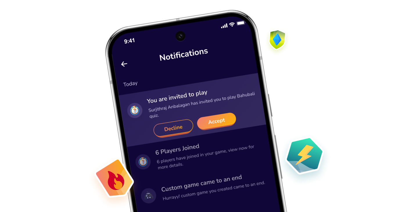
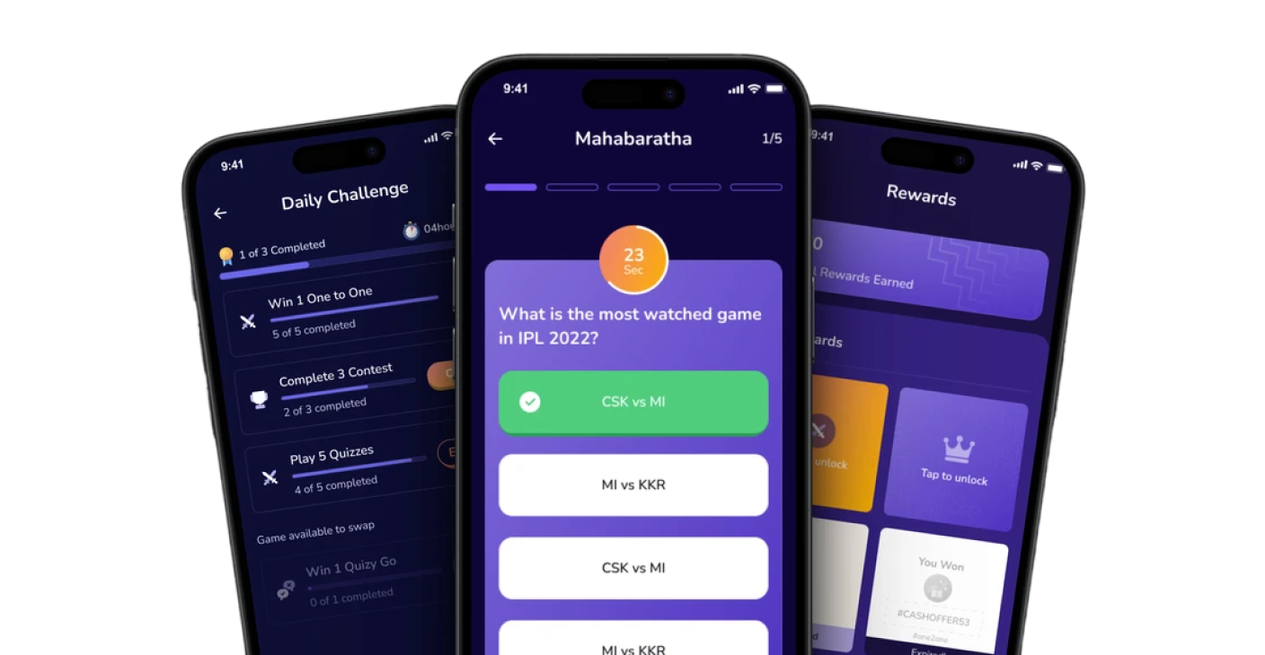
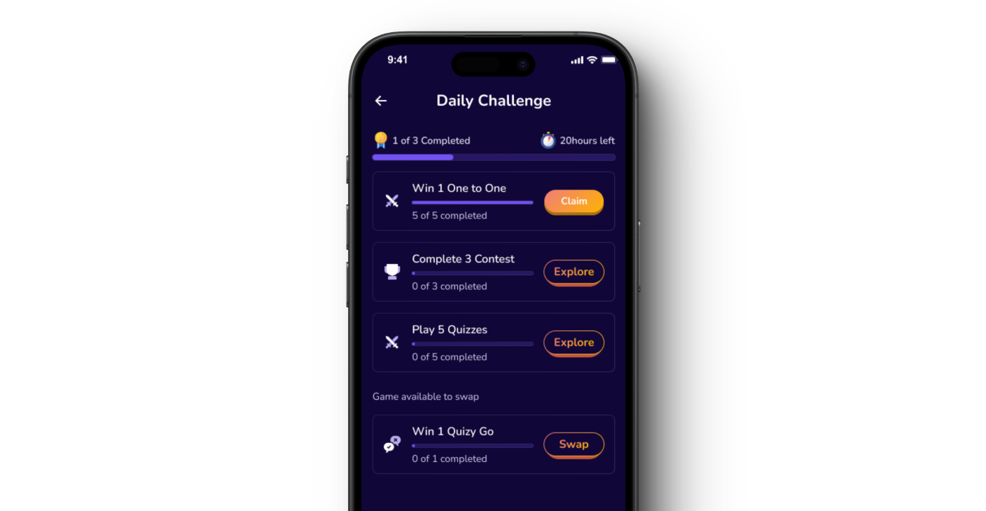
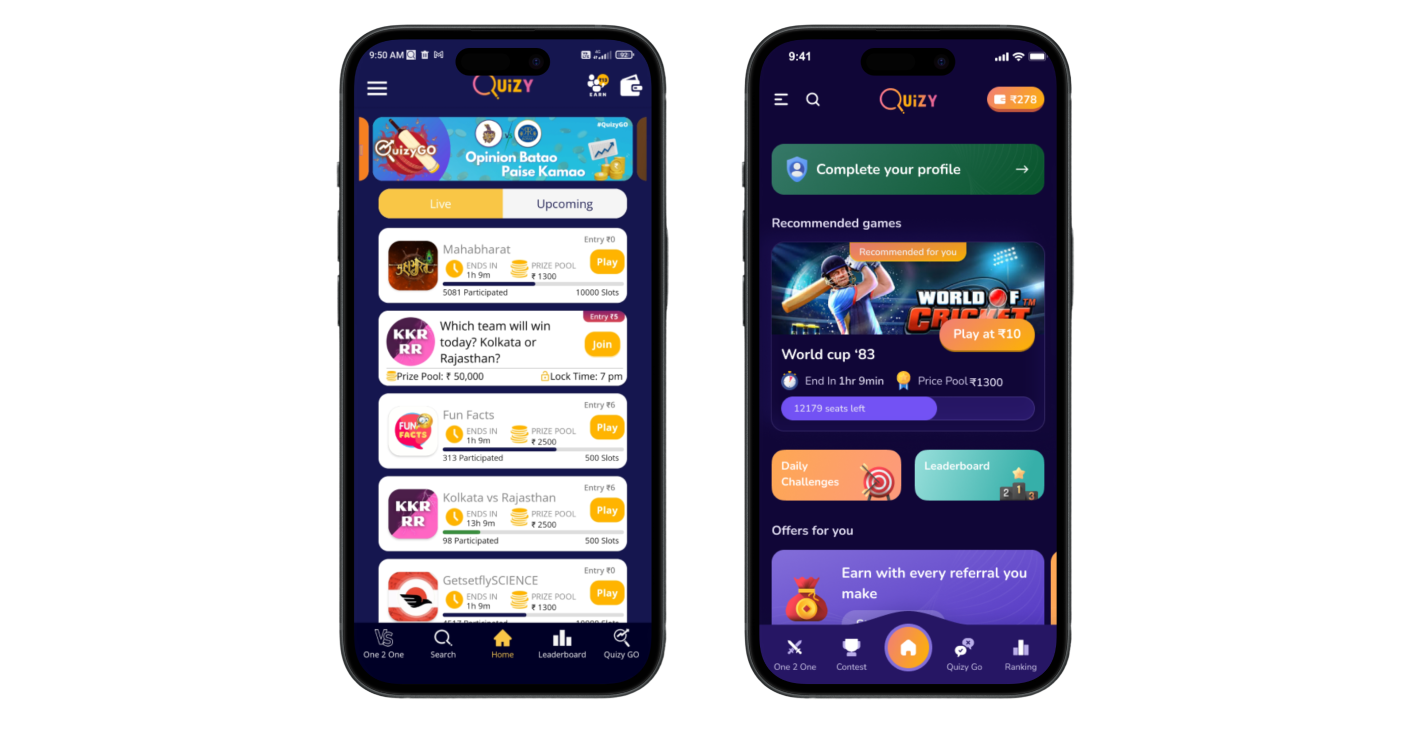
Trigger: Daily Challenge as the Starting Point
Instead of a generic dashboard, players saw a time-bound Daily Challenge.
This reduced decision fatigue and gave users one clear action to start.
- •Clear hierarchy improved discoverability
- •Countdown and progress bars added urgency
- •Notification-friendly entry point improved re-engagement
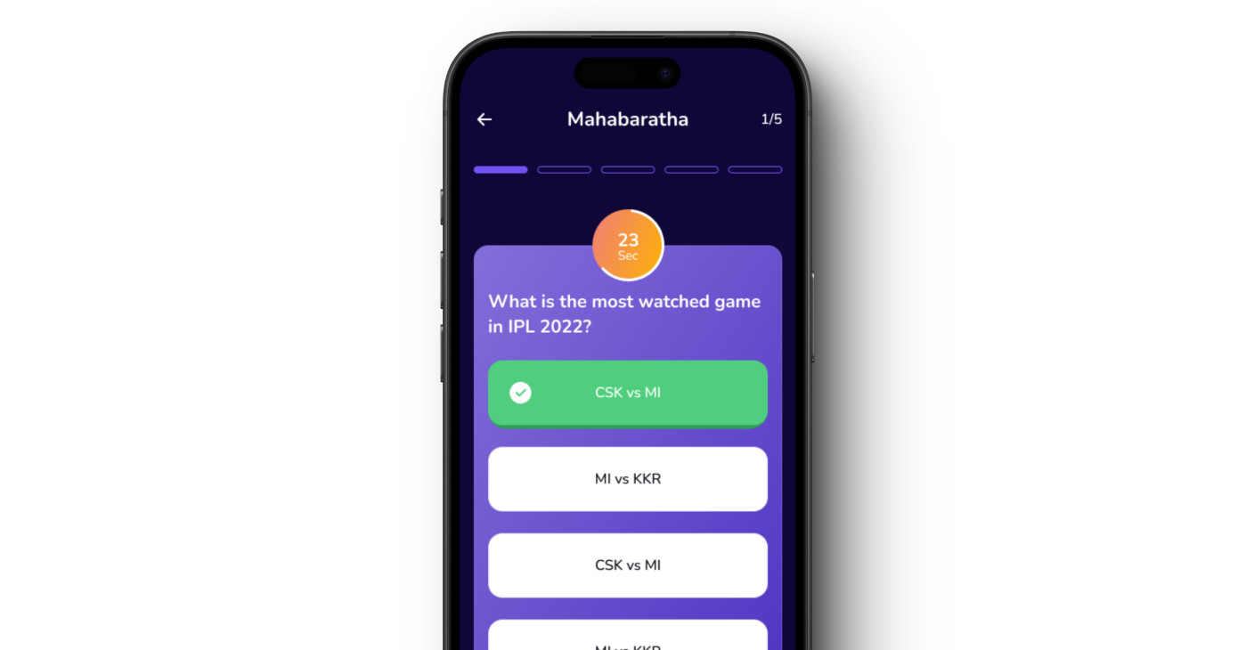
Action: Fast Gameplay with Low Cognitive Load
Questions were shown in a short, focused flow with immediate feedback.
The interaction was optimized for quick sessions during breaks and commute time.
- •Reduced friction from app open to first answer
- •Simple question cards improved readability
- •Short sessions improved completion rate
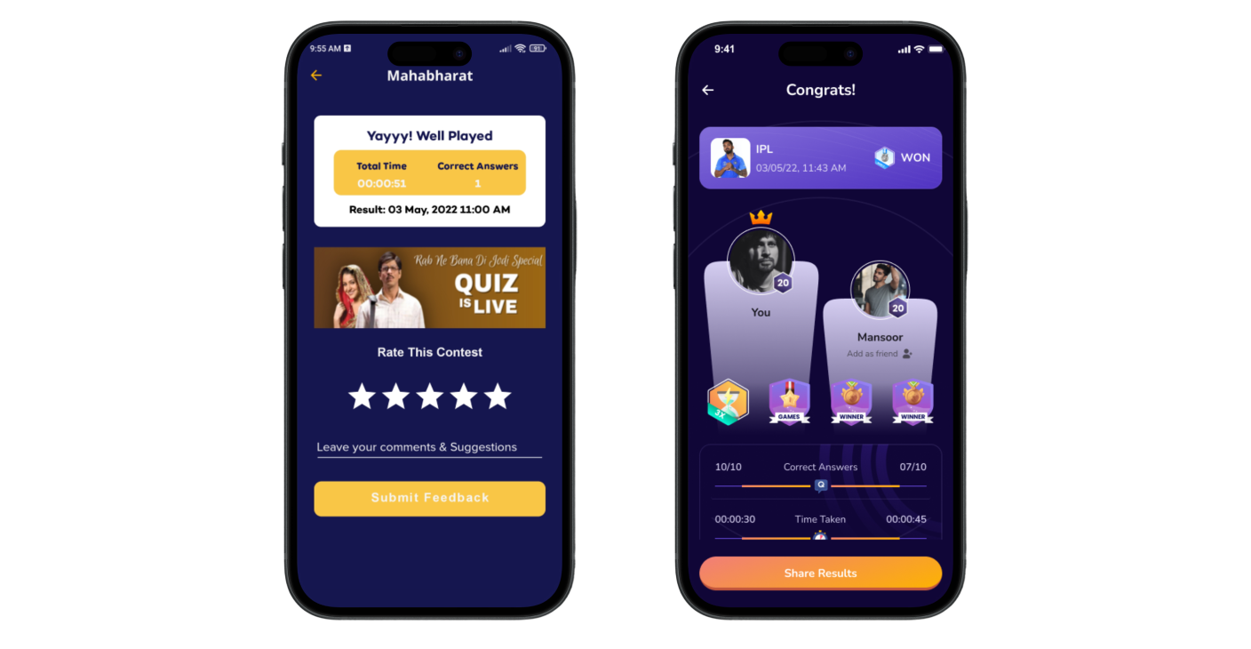
Variable Reward: Celebrate Progress Instantly
After task completion, users received contextual badges and celebratory feedback.
These small wins made progress visible and emotionally rewarding.
- •Reward modal reinforced positive behavior
- •Badges created a sense of achievement
- •Moment-based feedback increased return intent
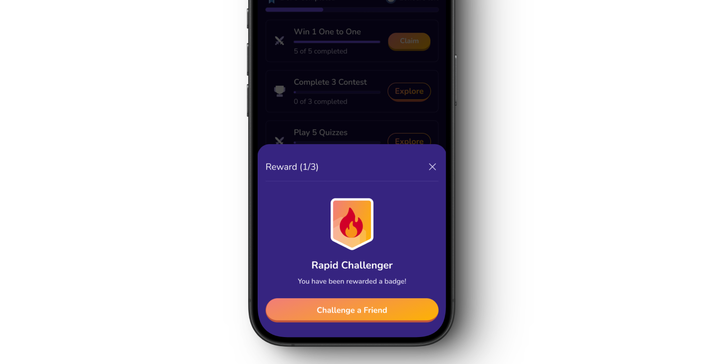
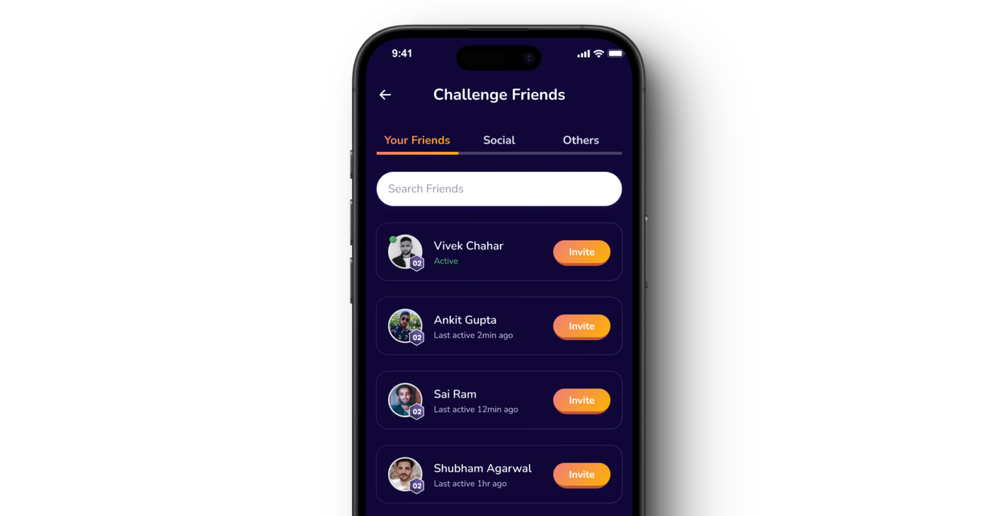
Investment: Turn Solo Play into Social Play
From the reward moment, users could challenge friends directly.
This added social accountability and made the loop feel collaborative.
- •Invite flow increased commitment to return
- •Peer challenge created stronger motivation
- •Social loop supported organic growth
Outcome: Stronger Retention and Clearer Product Value
The redesigned loop made the experience easier to understand and more rewarding every day.
Users now had a clear reason to return, complete goals, and stay engaged longer.
- •Client reported a meaningful improvement in 28-day retention
- •Daily active users grew significantly over 90 days
- •Notification click-through improved notably after the redesign
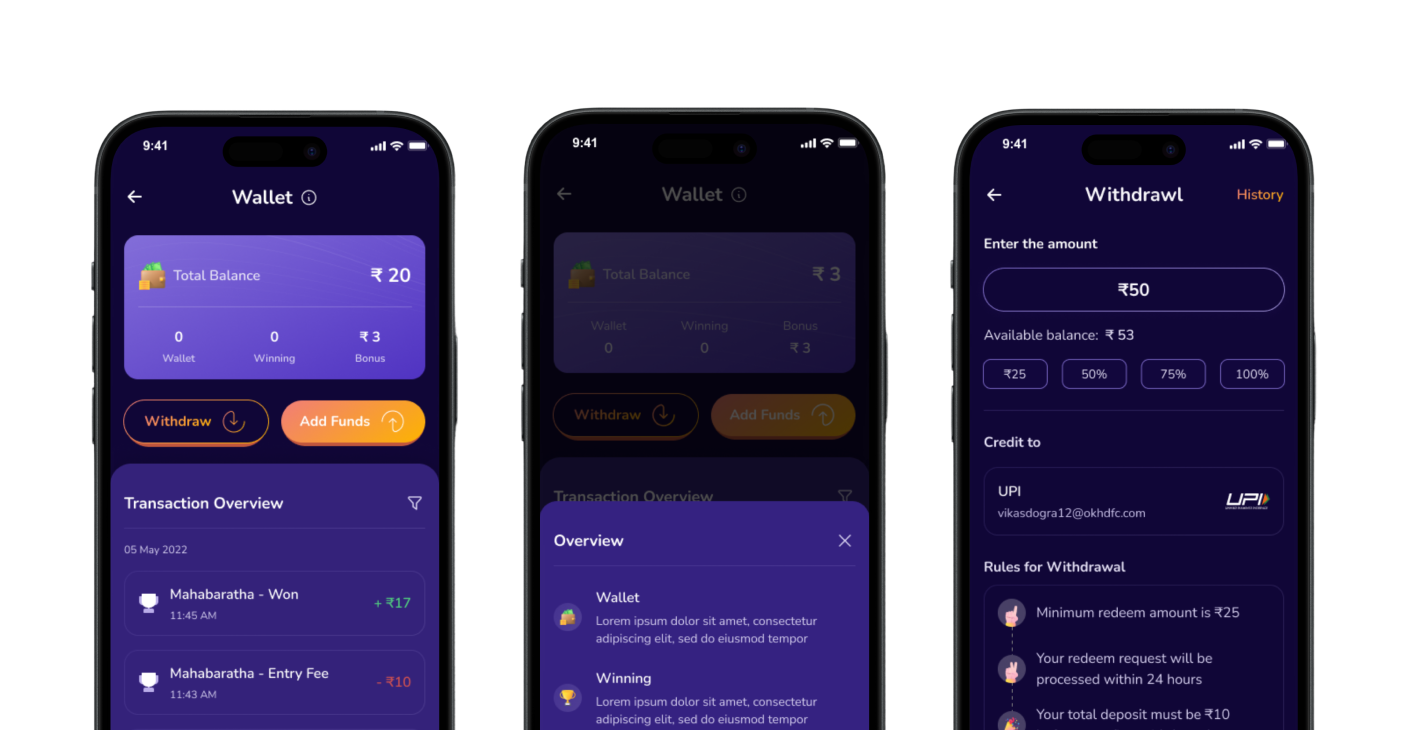
Trust & Transparency: Reducing Drop-Off at Critical Moments
Real-money apps lose users when withdrawal or add-money flows feel unclear or risky. We added contextual help — inline terminology explanations and step-by-step withdrawal guidance — to reduce friction and errors at these high-stakes moments.
This wasn't just good UX; it directly improved revenue-linked task completion.
- •Client noted a clear drop in withdrawal errors post-launch
- •Add-money task success improved significantly
- •Contextual help reduced memory load on critical flows
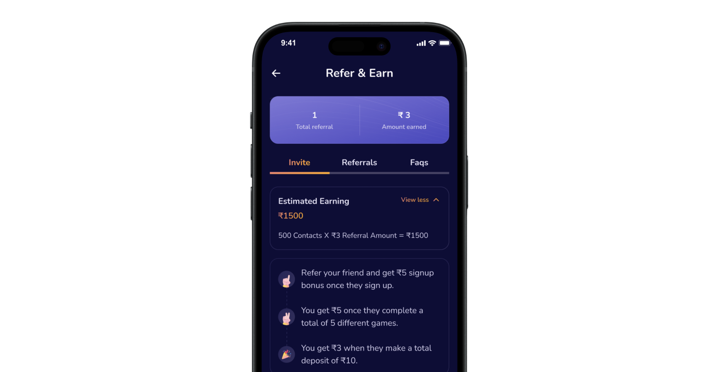
Referral Rewards: Turning Players into Advocates
Quizy is a real-money platform, so we leaned into that motivation. The referral flow surfaced estimated earnings from a user's contact list — making the value of inviting a friend tangible before they even tapped the button.
This framing shifted referrals from a social favor into a personal financial opportunity.
- •Contact list showed earning potential per friend
- •Referral progress tracked visibly in-app
- •Client reported strong referral growth over 90 days
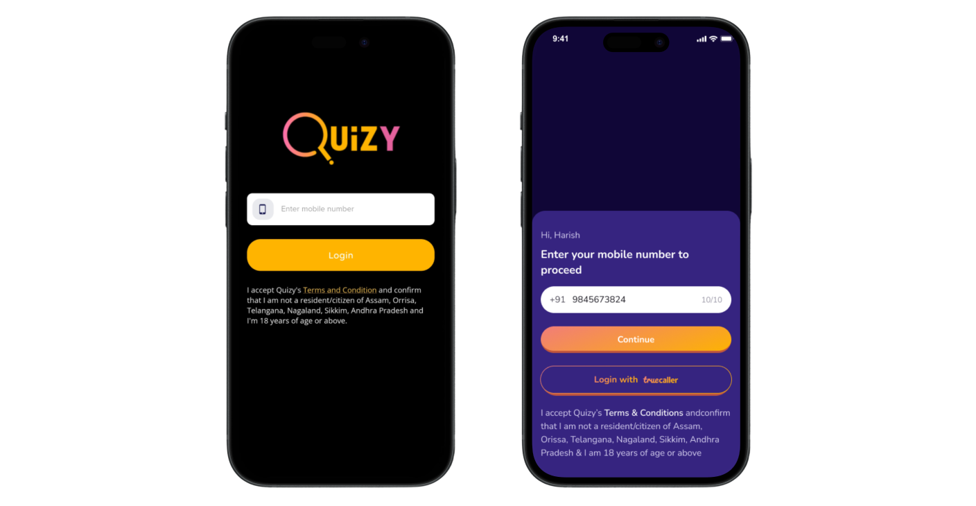
UI Revamp: Building a Consistent Foundation
The hook loop needed a solid UI system to sit on. We audited the existing screens and rebuilt the foundation — starting with login (adding Truecaller integration for one-tap sign-in) and the navigation structure.
Iconography was made consistent, actions were grouped logically, and the visual language was unified across all three game types.
- •Truecaller integration reduced login friction
- •Consistent iconography and logical action grouping
- •Unified visual language across One 2 One, Contest, and Quizy Go
Revamped Core Screens
Every primary screen was revisited — game entry, active gameplay, and post-game flows were rebuilt for speed and clarity.
The Goal Gradient Effect guided the action design: surfacing incomplete tasks and progress cues to psychologically nudge users toward completion, inspired by how Starbucks uses loyalty progress.
- •Game entry reduced to fewer taps
- •Progress cues increased task completion intent
- •Post-game flow tied directly into the reward + invite loop
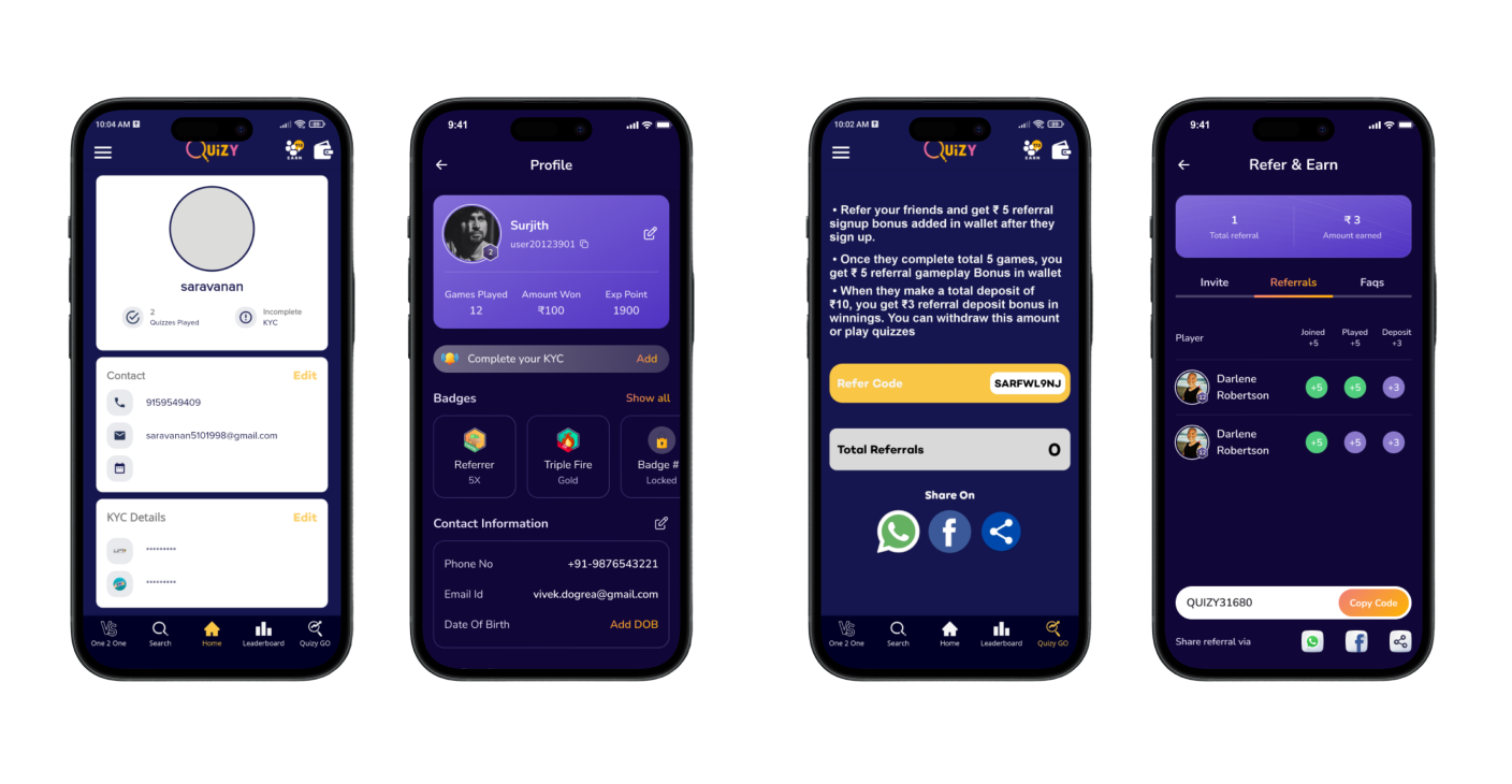
Leaderboard & Profile: Making Progress Visible
The leaderboard was redesigned to prioritize content over decoration — users could see their rank, gap to the next position, and recent activity without scrolling.
The profile page was overhauled to surface stats, badge collection, and referral earnings in a single glance, reinforcing the Investment phase of the hook loop.
- •Rank gap visibility increased competitive motivation
- •Badge collection made progress feel tangible
- •Referral earnings visible directly from profile
Referral Flow: Revamped for Clarity and Conversion
The referral section got a full visual and structural revamp — progress tracking, earnings visibility, and invite flows were rebuilt to feel native to the app rather than bolted on.
Users could now see exactly how close they were to earning a referral reward, making the act of inviting feel purposeful rather than hopeful.
- •Referral progress made visible at a glance
- •Estimated earnings surfaced before sending an invite
- •Invite flow redesigned for fewer taps to share