How a UX Revamp Helped AlgoBulls Raise $2M
A full product redesign that made algorithmic trading clearer, faster, and more trustworthy for retail investors.
Complete End-to-End Product Revamp
AlgoBulls offers automated trading connecting traders and strategists on one platform — covering strategy analysis, execution to brokerage accounts, paper trading, backtesting, and additional trading tools.
The brief was a full product revamp: reduce cognitive load for retail investors while preserving the depth power users depended on.
- •Industry: Fintech / Algorithmic Trading
- •Services: UX Research, UI Design, Prototyping
- •Process: UX Audit, Competitor Analysis, User Interviews
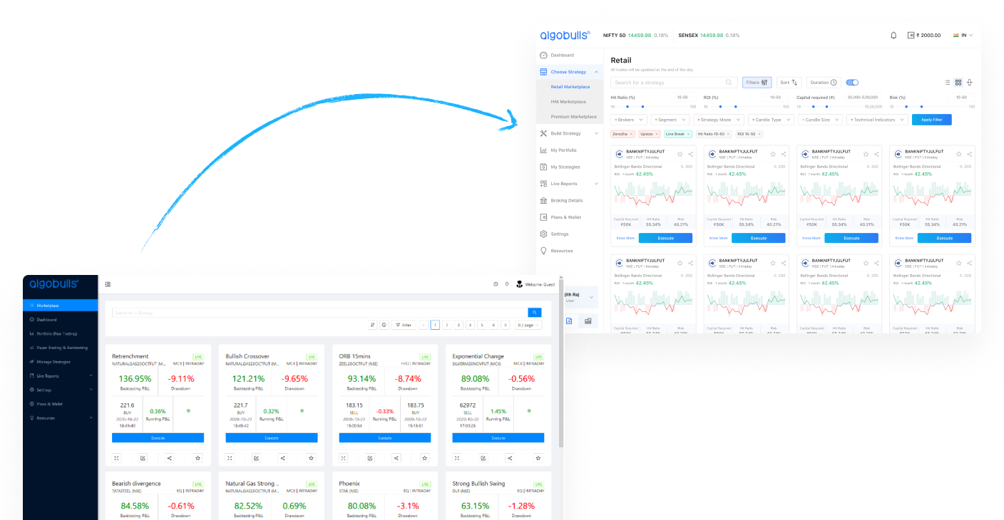
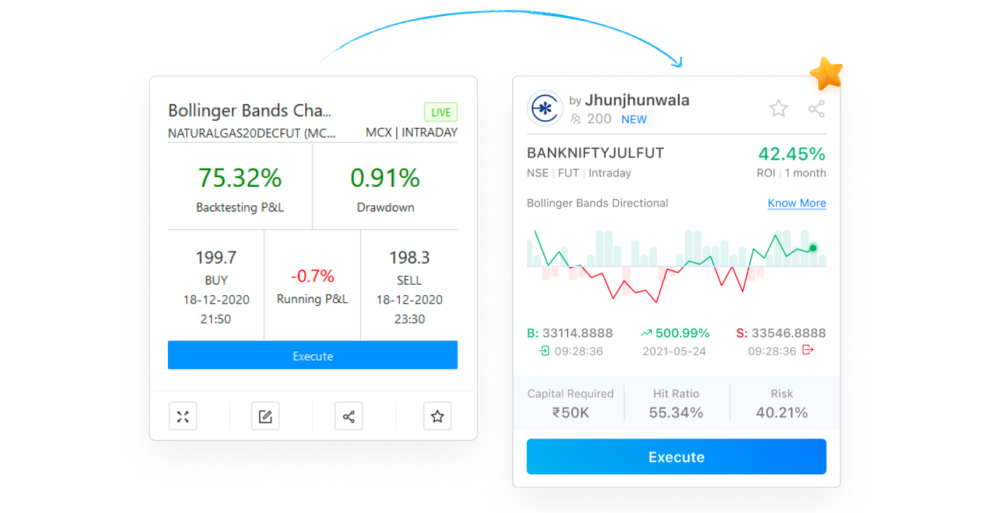
Marketplace Strategy Cards: Cut the Noise
Complex card design made it hard to assess strategy parameters at a glance.
We improved the visual summary using hybrid charts, applied Hick's law to reduce the number of choices surfaced at once, and reprioritized content based on user interview findings.
- •Problem: complex cards hindered quick parameter assessment
- •Applied Hick's law to reduce decision paralysis
- •Client confirmed users were choosing strategies notably faster
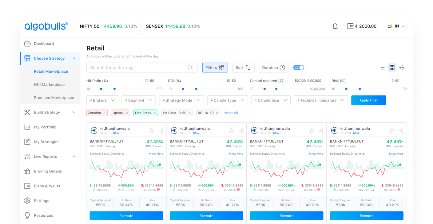
Advanced Filtering: Find the Right Strategy Faster
Users struggled to locate suitable trading strategies inside a flat, unorganized list.
We implemented advanced filters and introduced trading-capital-based categorization so users could narrow down to relevant options in fewer steps.
- •Problem: no structured way to discover matching strategies
- •Trading-capital-based categories reduced irrelevant results
- •Users found matching strategies significantly faster post-launch
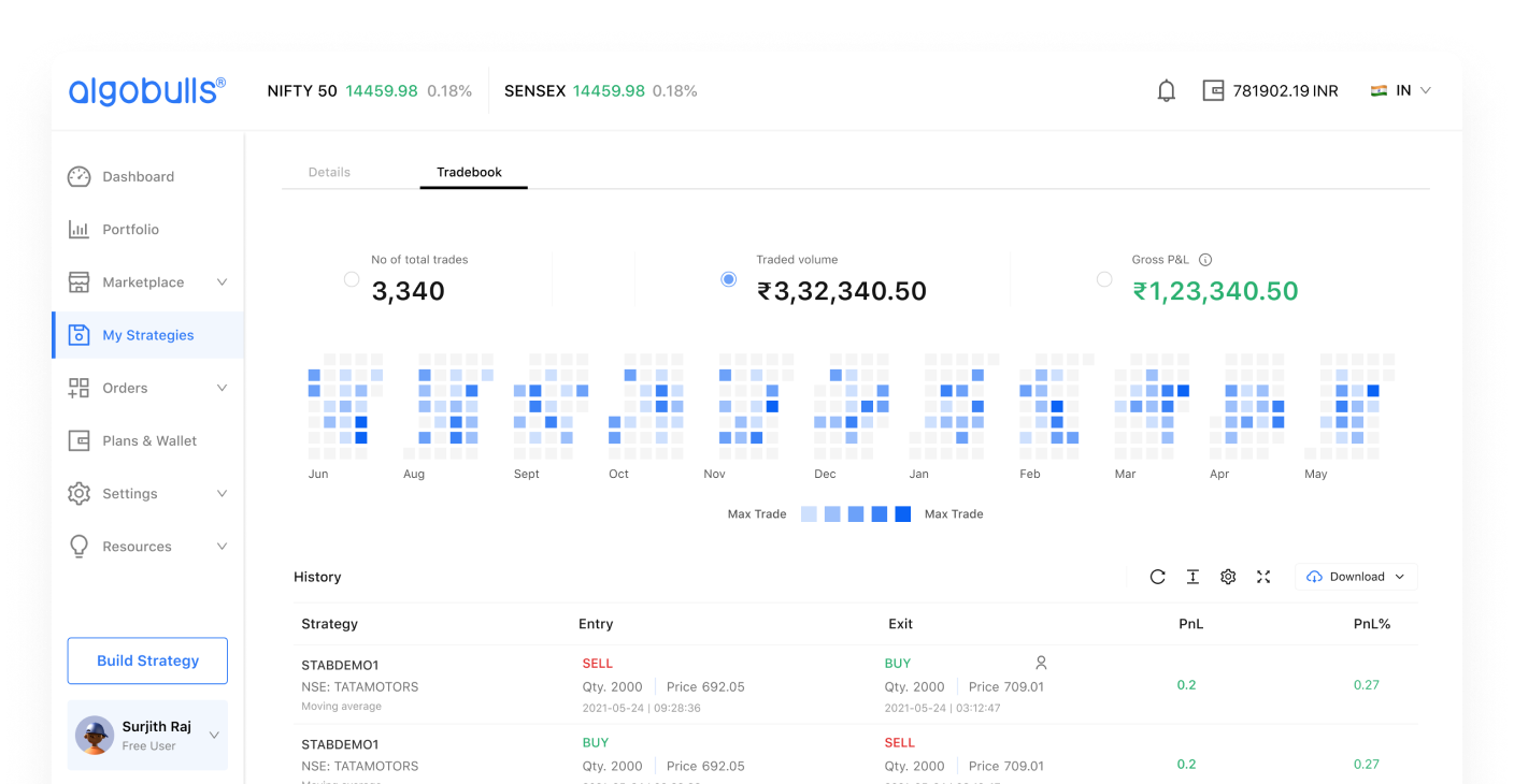
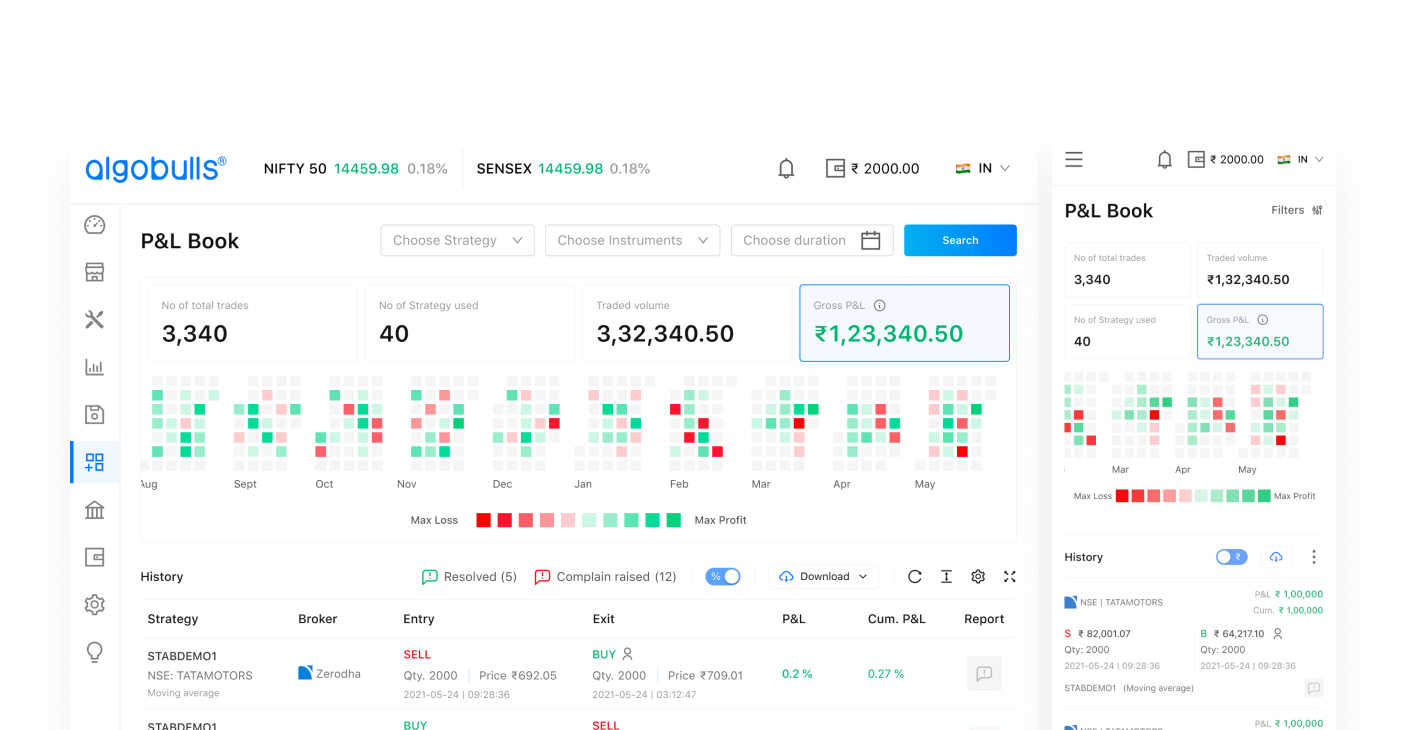
Enhanced Reports: See Patterns, Not Just Numbers
Trade pattern and profit tracking was difficult in dense, row-heavy table views.
We added a heatmap visualization layer so users could spot momentum, streaks, and volatility at a glance — without scrolling through hundreds of rows.
- •Problem: critical patterns were buried in raw data tables
- •Heatmap made trade pattern recognition immediate
- •Users gained data insights without manual analysis
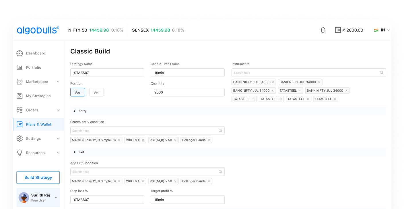
No-Code Strategy Builder: Open the Market to Everyone
Non-coders who wanted to create custom trading strategies had to hire external developers — making it expensive and inaccessible.
We designed a zero-code strategy creation interface so any user could build, test, and deploy strategies independently.
- •Problem: non-coders depended on expensive external help
- •Zero-code builder democratized strategy development
- •The no-code builder saw strong adoption among non-technical users
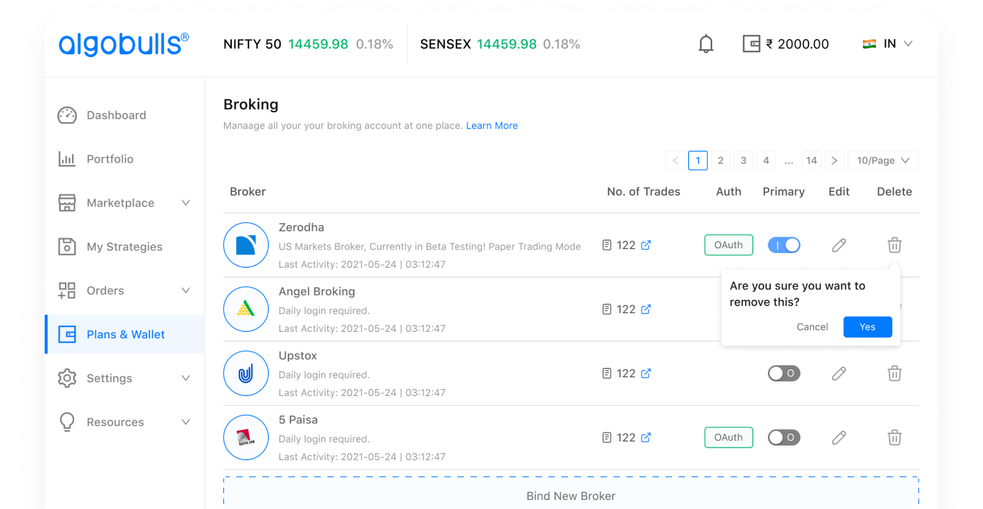
Multi-Broker Integration: Trade Across Platforms Seamlessly
Switching between brokerage accounts was time-consuming and broke the user's trading flow.
We introduced seamless multi-broker support with a unified interface for faster account switching and consolidated portfolio visibility.
- •Problem: account switching added friction to every session
- •Unified multi-broker interface reduced transition steps
- •Client noted significant reduction in account-switching friction
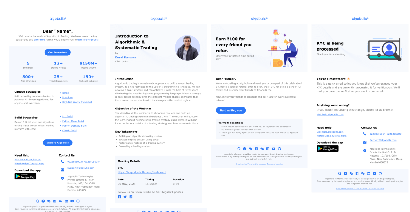
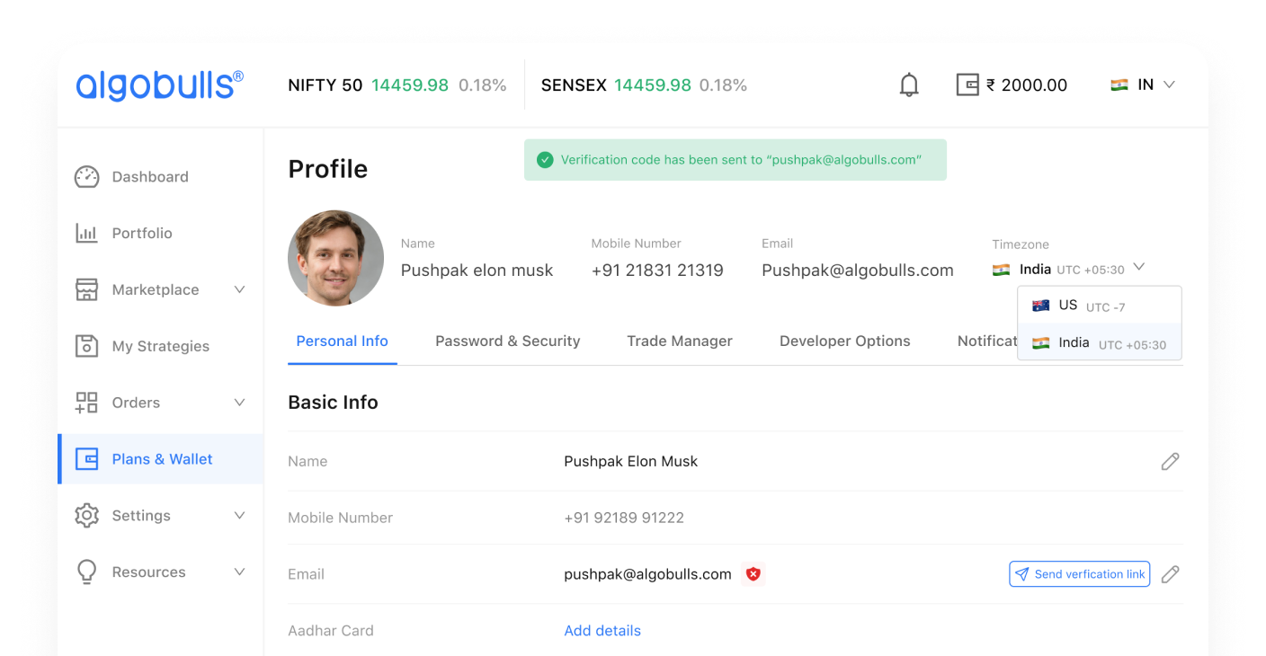
Trade Alerts & Mailers: Keeping Users in the Loop
Users were missing critical trade events — executions, strategy updates, and P&L milestones — because there was no reliable notification layer outside the app.
We designed a system of contextual email alerts and mailers that surfaced the right information at the right time, giving users confidence that their trades were always accounted for.
- •Problem: users had no reliable visibility outside the platform
- •Contextual trade alerts reduced users' need to stay logged in
- •Client reported improved user trust and reduced support queries
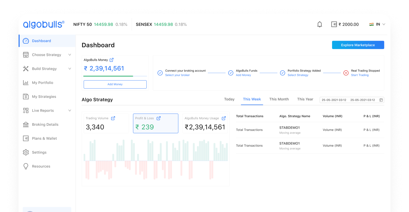
Strategy Overview: At-a-Glance Performance
Users needed a single place to monitor live and historical strategy performance without navigating across multiple sections.
We consolidated key performance indicators, live status, and return summaries into a clear strategy overview — reducing the cognitive effort of daily portfolio monitoring.
- •Problem: performance data was scattered across disconnected screens
- •Consolidated view reduced navigation burden significantly
- •Users could assess strategy health at a glance
Backtesting Interface: Test Before You Invest
The existing backtesting flow was technical and intimidating — users often skipped it entirely, leading to uninformed live deployments.
We redesigned the interface to surface results more clearly, with visual summaries of risk, return, and drawdown in a format that non-expert users could interpret.
- •Problem: backtesting was too technical for retail users to act on
- •Visual result summaries made risk assessment more accessible
- •Client noted increased backtesting engagement pre-deployment

Paper Trading: Practice Without Risk
New users were hesitant to deploy capital without first understanding how their strategies would perform.
We gave paper trading a first-class interface — matching the live trading experience closely enough to be meaningful practice, while clearly communicating its simulated nature.
- •Problem: new users lacked confidence to deploy real capital
- •Paper trading flow mirrored live trading to build real familiarity
- •Client observed stronger conversion from paper to live trading
Final Impact: A Platform Investors Could Trust
The revamp shifted AlgoBulls from a data-heavy interface to a guided, confidence-first experience.
The client team noted meaningful improvements across trade speed, error reduction, and user activation — and the redesign contributed to the product narrative that supported a significant fundraise.
- •Improved usability for retail and semi-advanced investors
- •Higher user trust through clearer UX communication
- •Scalable design foundation for future product releases